To Top
The Danish paper Dagbladet Arbejderen (Daily Worker) is running a feature on the last three pages of my Honduran comic today, click here for this just-about-intelligible-enough translation courtesy of Google translate.
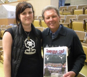
Roy Bourgeois, SOAW founder, at the NW Latin American Solidarity Conference on April 9
The Honduran comic made its printed debut at the NW Latin American Conference on Friday, where it was excitedly picked up by NGO leaders and activists from around the US, as well as by Archcomix hero Roy Bourgeois, founder of the School of the Americas Watch (see left). If you haven’t seen it already, check out the online documentary Father Roy: Inside the School of Assassins here. Thanks to Bruce Wilkinson for his support in organizing the event and getting me involved. A fundraiser in Washington DC to get more comics out to Honduras is also in the pipeline. I’ll keep you posted.
Now that I’m deep into the research stage of my upcoming comic on the Israeli lobby, I’ve been mulling over the creation of a visual database that would contextualize a number of seemingly disparate individuals (all of them influential and wealthy) within the various power-broking industries they belong to. A sort of yellow pages of power that would let readers see the connections between lobbying groups, political parties and multinationals on a personal level. Along the lines of transparency advocacy sites such as Open Secrets and Transparency International, but functioning at the level of the individual. With a sprinkling of interactivity thrown in for good measure. I’m delighted to say that the folks over at Muckety have beaten me to it – go there now (well, after you’ve read this, at least), enter a name into their search bar, and you’re instantly able to interactively explore their business, political and financial connections. Granted, it’s not an exhaustive directory, but it’s a fantastic tool for getting a sense of affiliations and influence.
Staying with that same goal of making websites easier to navigate and peruse information, you’ll notice I’ve re-organized this site’s pages to categorise the ever-expanding directory of comics into relevant topics, as well as added some new pages from recent projects. One of which is my recent collaboration with underground comics legend Harvey Pekar on a 55-page graphic history of Yiddish literature and culture. More about that on the Social Histories page.
For those of you in the Seattle, Washington area tomorrow, be sure to check out the NW Latin American Solidarity Organization conference, where the first copies of the Honduran Comic will be making their technicolour debuts. The rest of you will be pleased to know that copies have left the printers so should be with you in roughly two weeks. Another first is in order on Tuesday when the comic will appear both in print and online for Denmark’s The Daily Worker. Staying on the translated tip, more pages of the japanese translation can now be found at the bottom of the Honduras page.
Above is an extract from the final part of the Honduran comic to be translated, providing some historical context to the school of the americas. The observant amongst you will notice the search bar at the top of the window – stick “school of the americas” in there and it’ll bring up all related posts. Many thanks to Apture for such an awesome plugin.
As for news, scroll down to get your fill of this week’s announcements.
As you read each one, think about your reaction to the information, your level of engagement, and the likelihood of you wanting to find out more about this incident. Obviously, the amount of information will provoke a higher level of reader interest, so focus more on what factors are helping you to connect with the story (hint: it’s all about the visuals, as if you didn’t know that from being on this site already). All give different angles on the same incident, which took place almost 3 years ago in Baghdad.
1. From Reuters: July 12 – Photographer Namir Noor-Eldeen and driver Saeed Chmagh, both of whom worked for Reuters news agency, are killed in eastern Baghdad during clashes between U.S. forces and militants.
2. From the New York Times: BAGHDAD, July 12 (2007) — Clashes in a southeastern neighborhood here between the American military and Shiite militias on Thursday left at least 16 people dead, including two Reuters journalists who had driven to the area to cover the turbulence, according to an official at the Interior Ministry.
“They had arrived, got out of the car and started taking pictures, and people gathered,” Mr. Sahib said. “It looked like the American helicopters were firing against any gathering in the area, because when I got out of my car and started taking pictures, people gathered and an American helicopter fired a few rounds, but they hit the houses nearby and we ran for cover.”
3. Reuters again:
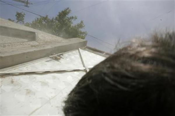
The last photo taken by Reuters photographer Namir Noor-Eldeen before he was killed on July 12, 2007
Photographer Namir Noor-Eldeen, 22, and driver Saeed Chmagh, 40, were killed in Baghdad on Thursday in what witnesses said was a U.S. helicopter attack and which police in a preliminary report called “random American bombardment”. The U.S. military in a statement issued just after midnight on Thursday described the incident as a firefight with insurgents. It has said the killings were being investigated.
“Our preliminary investigation raises real questions about whether there was fighting at the time the two men were killed,” said David Schlesinger, editor-in-chief of Reuters. Residents and witnesses interviewed by Reuters said they saw no gunmen in the immediate area where Noor-Eldeen and Chmagh were killed in Baghdad’s al-Amin al-Thaniyah neighborhood. They said they were not aware of any clashes in the area leading up to the Apache helicopter attack around 10.30 am local time. Noor-Eldeen and Chmagh had gone to the area after hearing of a U.S. air strike on a building around dawn that day.
On Sunday, the U.S. military returned to Reuters two digital cameras that belonged to Noor-Eldeen which were taken by American soldiers from the site of the deaths. No pictures taken by Noor-Eldeen on July 12 show clashes between militants and U.S. forces. The pictures show no gunmen, nor residents running for cover.
The U.S. military said last week it had called in “attack aviation reinforcement” after coming under fire from small arms and rocket-propelled grenades. Nine insurgents and two civilians “reported as employees for the Reuters news service” were killed, the statement said.
4. Video, courtesy of Wikileaks (visit their website for more information on their corporate/governmental whistle-blowing). Released earlier today at a press club meeting in Washington DC, the footage reportedly came through a source with connections to the military and has since been verified as legitimate and been broadcast globally (BBC, CNN, Al-Jazeera…) – here’s a full video report from Al-Jazeera (plus interview with the editor who published it online).
More on this tomorrow, but please post your comments/reactions – and retweet the link.
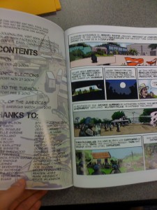 After what felt like an age of translating, tweaking, laying out, re-tweaking and all the rest in photoshop and indesign, I’m proud to announce that the first print run of the Honduran comic is underway as I type this. It should be ready in a few weeks time, so expect your copies around April 20th (US readers) and end of the month (rest of the world). I am now more aware than ever of the inevitable delays in going to print, but having seen one of the vast (almost full US letter size – see left with a stunt hand to give you a sense of proportion) copies in all its technicolour glory, I can tell you it’s well worth the wait. Thanks to Angela Vidergar for correcting my spanish translation for the second part. Now all I need are more orders to ensure I can push up the size of future print runs.
It’s always gratifying to see that it’s not just us self-publishers who are treading the precarious profit trail – apparently as of June, readers of the times in the UK will pay a princely £1 for the privilege of access to www.thetimes.co.uk for a day, or £2 for the working week. Here’s the full skinny, courtesy of that trusted bastion of fine journalism, The Sun. Surely it can’t mean a wholesale lockout/access denied scenario for the more parsimonious amongst us – it’ll probably be a bare bones version with none of the rich content that’s up there at the moment. Question is, will that prompt a split in news content between raw twitter-esque headlines and live feeds, embedded content and video/audio sources? Answers in the comments section. Speaking of which, the illustrious winner of the last post’s quiz on the most corrupt country in the world is…Somalia, closely followed by Afghanistan. The verdant wonderland that is New Zealand sneaked the least corrupt prize.
Perhaps the self-proclaimed “most revolutionary magazine in the world” holds some of the answers to the above question. Launched by Andy Warhol 40 years ago, Interview magazine’s ipad version seems remarkably unrevolutionary from the below video. In fact, the only stand out moments from the slideshow/larger iphone feel of the preview is the embedded live video. Until creators start to rethink the way they create content instead of simply publish it, all this digital innovation will seem like whistle-and-bells add-ons to the existing mode of information delivery. Decide for yourselves below:
If you liked the centralized approach to presenting disparate sources via google’s living stories engine test yesterday, but thought it lacked a narrative element to keep your interest buoyant against the tides of fast-aggregating real-time news feed, then I’ve got just the antidote, albeit one that’s not very current. Below is a phenomenal piece of multimedia journalism, housing photos, testimonies, vivid characterization and storytelling in the same site. As if that wasn’t enough, it’s all interactive. Here it is, an interactive photo essay by the French photojournalist Gilles Peress, documenting the last weeks of the siege of Sarajevo in February and March, including the exodus of Serbs from the suburbs from which the siege had been mounted. It’s a meticulously documented narrative, so take your time to wade through it – sadly we’ve missed the window mentioned here to join the online debate about the topic (only by 16 odd years), but it stands as a innovative approach to fostering debate between readers and journalists.
For more of a one-shot visual approach to interactivity, check out this interactive map of global corruption in the public sector. The darker the blue, the more corrupt the country. Any guesses for the most corrupt, before you sneak a peak? Leave your answer as a comment. Speaking of comments, I’ve also just finished the final translation for the Honduran comic into spanish, and posted it as a word doc in the Honduras page, here. If you’ve got a good level of english/spanish translation skill, then please have a look and leave me a comment with any suggestions or changes. Gracias!
I’ve finally come good on my promise to translate the rest of the Honduran coup comic into spanish, which the polyglots amongst you can read here. Feel free to send me any corrections, suggestions or translation errors that may have slipped past my iron-clad grammatical grasp. I’ve also added a Honduran comic thread to the discussion forum on the Archcomix page, so click here and get posting on it. The other big news is that Ryuhei Okada of the Caracas Cafe blog has offered to translate the Honduran coup comic and Right to Return into japanese, so big thanks to him.
Lately I’ve been looking into how animators around the world have been combining narratives with a journalistic message to give a different perspective on news issues and show us what life is like in typically inaccessible parts of the world. One striking example is Fatenah (left) from Palestine, telling the story of a young girl of the same name who’s grown up in the Gaza strip.
Speaking of bringing stories to life, I also recently came across Google’s living stories, part of an online experiment that houses all the contextual information to a specific news story in the same template, similar to a google wave document in a lot of ways. Granted, it still suffers from the same scroll down beyond the break ad infinitum of standard online news sources, but it’s certainly a start. Let me know what you think in the comments section. More cartoons and sequential journalism later on tomorrow.
UPDATE: Scroll down if you haven’t read today’s post for the backstory on Oscar Romero’s assassination, 30 years ago today. For those of you that have, check out this video from the Daily Show’s recent segment on the Texas board of education members who are essentially in charge of dictating the national curriculum, given that their state orders the most copies of school textbooks. The worrying part involving Oscar Romero begins at 2:50, and shows Patrica Hardy from the Texas State Board of Education arguing that Romero should be omitted from text books…because no one knows who he is.
Today marks the 30th anniversary of the murder of Salvadorean Archbishop Oscar Romero, murdered by paramilitary troops at the altar as he celebrated mass, and commemorated in the above snippet from my comic that featured in the latest issue of Presente! To read the comic, click back to the Archcomix archive here, or order your copy of the Honduran Coup: A graphic history using the button on the right sidebar. Here’s the report from the BBC.
Many have linked Romero’s murder to the work of Roberto D’Aubuisson, far-rightist national guardsman who is alleged to have led deathsquads during El Salvador’s bloody civil war, apparently earning him the nickname ‘blowtorch bob’. Here’s his obituary from the NYTimes, which quotes former Salvadorean President Cristiani as labelling D’Aubuisson, “a fighter to open political spaces and look for a democratic path in the country”. Is ‘opening political spaces’ a diplomatic term for “leading a deathsquad”? Use your readerly judgement. Either way, it’s better than “a pathological killer”, which was US Ambassador Robert E. White’s epithet for him. One thing that is undeniable is D’Aubuisson’s links to the School of the Americas (now WHINSEC), placing him in the company of a veritable who’s-who of Latin American military top brass who had a similarly proactive attitude towards “opening political spaces”. Visit the School of the Americas Watch to find out more and get involved.
Below is footage from multiple witnesses of the shooting, eerily chronicling the turn of events from both the shooters’ and the congregation’s perspectives. Thanks to Tim’s ElSalvador Blog for the video.