The piece is indebted to John Perry’s summation of the crisis in the August 6, 2009 issue of London Review of Books. Perry does a great job rooting the crisis in the continuing relationship between the United States and Honduras.
Maria Lohman of Somos Sur’s slideshow “Honduras: mas alla del golpe”
Honduras Coup 2009
Broadcasts from Democracy Now!
We’d also like to recognize the following sources for picture reference:
Susan Meiselas
Democracynow.org
BBC News
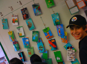
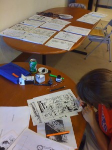
I can’t even remember the last time I posted so thank you my ever loyal web audience for hanging in there. I’ve just finished up teaching a 6-week comics course (2 classes a day, producing roughly 15 hand-drawn, inked and scanned 8-page minicomics every 10 days), the fruits of which (not to mention the labour) you can see below:


 Subject-wise, we had (deep breath): evil pillows; talking dogs; mice catching live cheese; toxic gloop; a shelter for made-up creatures called ‘hubs’; a talking cat bent on taking over the world; meteors; robot beauty pageants; musclemen (of course); talking pillows
(obviously a pillow trend going around 5-6th graders); time machines;
vampires; talking muffins; fratricidal ghosts; talking flying fish;
mysterious packages containing penguins; cute campers who have to
butcher a bear to survive out in the woods; twin weiner dogs; a halo
take-off; insurance clerks; talking toast; a water droplet and a
transvestite called Gerald. That’s all off the top of my head.
Whilst that’s been going on we’ve also -almost-managed to put to bed the Stanford Graphic Novel’s latest oeuvre. An amazing graphic novel set in one of the DR Congo’s National parks, it’s some 200 odd pages and is a testament to the drive, passion and commitment of everyone involved that it was first started back in January. Here’s a sneak preview of some of the revisions that are currently being frantically re-inked:
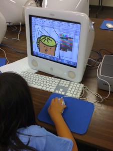
 Just when you thought I was going to take a break (or maybe that’s just my loving and tolerant wife), I’ve also turned my hand to animation, which is timely given the fact that as of tomorrow I’ll be teaching 3 weeks of Flash animation at San Jose’s tech museum. I’ll post my latest cartoon below, fingers crossed it works. Thanks to Queen for providing the soundtrack. I’ve also stuck some new watercolours up in the Gallery section for those of you interested in seeing my new colourful direction – quite how I can embrace that whilst not tripling how long it takes me to finish a page is, as yet, beyond me. Feel free to send in any suggestions.
Lastly, but by no means leastly, the hardhats piece continues to trundle along like the inky juggernaut it is – up to p.18 at the last count, though I’m reluctant to post any more pages up given the zany idea of actually making some money by having it published. News of that will be forthcoming, so stay tuned.
Here’s that cartoon I promised:
 The first time I opened The Lindbergh Child, it was hard not to be impressed by the artwork. The meticulous hatching, the double bordered panel outlines, the perfectly laid out text always running parallel to the panel borders – there’s a lot to admire. But unlike Laika, once I got a few pages in, I found the art to actually be a barrier to my immersion in the narrative. Each page seemed so crafted, so planned out (no mean feat next to Abadzis’s 8 drafts of every page) that it stifled the flow, and reminded me at several different points that I was reading a very well-researched graphic documentary of an event, as opposed to reliving it in the way I did Laika.
Going back to the artwork briefly, the key to leading a reader’s eye across a page of comics lies in “spotting” the blacks – that is, positioning large masses of black around the page to highlight specific parts. For example, the back of Violet Sharpe’s head on the second page of Part Four (ah the joys of no page numbers). Geary’s decision to reflect the character of the time – a society that stressed formality and rigidity to certain norms – in his heavy black panel borders undoubtedly lends an extra dimension to our understanding of the time the novel was set in. However, it does this at the expense of our ability to read each page easily – very quickly I found that against such a heavy black background, the detail of the panels with all their hatching soon greyed out and flattened the images within them. Take the first page of Part Seven, when we see Hauptmann behind bars – compare the top half of the page with the bottom and see how his lower body blends against the unnecessary detail behind him in the cell.
The next most significant factor in jarring me out of the narrative was the running commentary given to us in the form of captions, which at times lapsed into plain and simple illustration of what was drawn in the panel below. Condon’s rendez-vous in the St. Raymond’s cemetery breaks one of the cardinal rules in comics of ‘show, don’t tell’ – we see Condon in the middle of the panel, a car behind him and the gate of the cemetery to his right. The caption reads: “They stop at the Cemetery’s entrance, Condon gets out, leaving Lindbergh in the car. But he hesitates to enter the dark and threatening interior”.
The opportunity to highlight his internal monologue and introduce a more subjective POV is refuted by the dry, objective third person narrator. A sign for the cemetery and a close up on Condon’s hesitant, apprehensive face with Lindbergh telling him he’s wait in the car would have conveyed the same information with a much better sense of mood and atmosphere.
It’s not all bad, though! The sheer amount of detail and information Geary fits in clearly meant he had to choose between characterization or documentation and he chose the latter, leaving it to read like more of a court document than a dramatization. But in certain instances when the evidence comes to the fore, this approach works perfectly: the two pages describing poor Arthur Koehler’s journey around the country on the trail of wood with the same seam is a testament to both his and Geary’s borderline obsession with uncovering every last shred of evidence in the case.
I certainly learned a lot from this book about the case, but it definitely didn’t have anywhere near the same emotional punch as Laika did. In fact, I was more exasperated by the futility of the ending than I was actually sympathetic. But as an artist who sometimes falls into the same trap of using characters purely as vehicles to advance the plot of a comic, I identified with many of Geary’s decisions and will take away several lessons in how to improve my own work.
 I’m back in Cali after an xmas jaunt to the UK, hence the lack of recent updates, and it’s all kicking off. I’ve just finished next month’s Bash piece on Nigerian beggars, and am putting to bed the latest issue of Archcomix, which contains all of my recent non-fictional work. The Chile strip will be picking back up now, so be sure to stay tuned. I’m aiming to get it all done and dusted by Jan 28th. Fingers crossed.
I’ve joined the Stanford Graphic Novel Project as a TA of some description, where I’ll be contributing my artistic insights into what will be the follow-up to the highly successful Shake Girl graphic novel they made during last year’s class. Today’s assignement was a crit of Nick Abadzis’s Laika, which blew me away. Fantastic storytelling, great characters, excellent use of colour – well, why don’t you just read my 2 cents below:
For a story that is so tightly paced and heavily research-driven, there is a great looseness to the style of the book. Abadzis’s use of two techniques – drybrushing (using a paintbrush caked with dried ink to create a jagged, scratchy line) and drawing with a china marker (again, leaving a crayon-like mark) are both clearly visible on the cover and lend a real hand-crafted, impressionistic feel to the book. Both of these rely on being combined with colour to bring them to life, and the first sequence of Korolev’s escape from the Gulag shows just how crucial colorist Hilary Sycamore’s contribution to the book was. One subtle effect is the use of colour in the page background (in between panels) to reflect the change in temperature and mood – from the bleak black desperation of the first shot of Korolev, which gradually lightens with the presence of moon, until changing to normal white when he arrives at the inn. In a nice parallel, characters or backgrounds are reversed to their black and white negatives in moments of extreme emotion – such as p.14 when Korolev comes close to death, or p.143 when Yelena is told about Laika’s tragic fate.
 Abadzis seems well aware of his own weaknesses, hence the scarcity of large panel close-ups on chracters’ faces – one such jarring example being the old lady’s face on p26. However, when he gives up on accurate representation and instead aims to convey raw emotion, the faces get really interesting – see Mikhail’s anger on p37 or his demagogic Dad’s on p.31. When he does go in for a close-up, Abadzis ramps up his use of blacks and the grease pencil, like p.14, 119, 137, although I think he’d have been better off preserving the consistency of his ‘less is more’ style for the sake of heightening the drama.
Certainly, page layouts carefully consider their setting – p11’s vertical panels to emphasize the starry sky and the expanse between Korolev and the moon; p82 horizontal format and rhythmic ‘to and fro’ contrast of Kudryavka and the technicians testing for G-force, and of course the dream sequences. But one original addition that crops up a few times is Adbadzis’s use of overlapping panels, which work as a full-stop/periods, overriding the authority of the page breaks to jump space/time: p.20’s change of scene from Antonina and Mishin’s chat to Korolev’s meeting with Krushchev; the p.38 jump from Mikhail being outside to his decision later that night to drown poor old Laika; or to show the time lapse in p.147 when Laika’s being operated on. He quickly builds up a visual vocabulary so that we know immediately that a circular, non-bordered panel is a window into Laika’s dream-state (p. 88).
I felt the book started strong, but lost some of its power in the build-up to the launch as it sacrificed its characters to the needs of the plot. The wordless episodes early on where the emphasis was on Kudryavka’s character as she experiences the world around her – foraging for food after surviving being dumped in the river, or experiencing zero gravity for the first time (p.91) – really stood out as we watched the dog’s personality come to the fore against a really rich, vivid background.
Above Panel from Laika by Nick Abadzis, courtesy of First Second Books
Courtesy of who else but Burger King. Their new ad campaign in the US, brainchild of some blue-sky nutjob at an uber trendy ad agency, sees unwitting townspeople from remote rural areas of Asia be subjected to a taste test between a Whopper and a Big Mac. It’s like some sort of postcolonial pastiche you’d expect on Saturday Night Live: look at the savages! They haven’t even seen a Whopper before! Bless their virgin tastebuds! Urrrgh.
Here’s the link – the cynics amongst you might see this as propagating the viral contagion of this horrorshow (a big incentive in adland, lest we forget) but this is really something that has to be seen to be believed. Plus it’s part of a larger article predictably drawing similar amounts of bile over at the Guardian.
As a more palatable salve to the above, my interview in The Other Side magazine is now out and online – click here to read the digital edition. I’m on p.8 plug plug (though I’ll consider you one of the converted seeing as you’ve already made it to my site).
I know I’m due pages on the Chile strip – it’s coming, it’s coming – I’ve been backed up with Bash work, of which all I can tell you is my latest piece about raging grannies took longer to put to bed than I expected. You’ll see what I mean in January, honest.
What a week it’s been. I just got my hands on the comics anthology Paper TV, which was created by the class I taught earlier this semester at 826 Valencia, Dave Eggers’ Writing Center down in the Mission, and looks pretty damn awesome. I’ve also been interviewed in the December issue of The Other Side Magazine, so prepare to pounce on that next month all you Londoners. AND I’ve got a piece in the Spring edition of Memoir (and), which is a literary journal specializing in creative non-fiction. The piece is a colloboration I did with a friend of mine (nice one Olly) about gang violence in Nigeria. You can read it in the Comix section on this very site.
Last week was beyond hectic. A whirlwind tour of the East Coast, taking in Vermont, Greenwich and NYC, followed by a stint hosting the Center for Cartoon Studies‘ table at San Francisco’s Alternative Press Expo. Here’s a photo of me at the table looking as primed as you can be after a non-sleep redeye the night before.
As well as manning the table, along with CCS students and alumni (thanks Gabby, Kenny, Denis, Colleen, Emilie and Lauren!) I ran a colour workshop with Jenny Hansen, veteran color designer who has worked on shows like Happy Tree Friends and Batman: the animated series. Jenny waxed lyrical about using value, hue and varied palettes to creating and emphasizing mood in comics, and I was humbled to have her colour one of my panels as part of the live demo, which you can see here.
Last but not least, here’s a caricature of Karl Marx strutting about like Mick Jagger that I did for a friend’s housewarming last night. No nods to the President Obama being a socialist thankyouverymuch. Cheers for the party Nikil and Shannon!