To Top
As promised above, here is a link to the Yiddishkeit slideshow detailing my process of turning a comics script into finished pages, including using visual references, digital colouring in photoshop, thumbnailing, all that good stuff. Here is the Kickstarter campaign to erect a statue in Harvey’s native Cleveland.
Many thanks to Sterling Warner at Evergreen Valley College in San Jose for inviting me to talk about my work and comics journalism in general on Wednesday. It was great talking to the next generation of visual storytellers afterwards and I hope that some of them have made it here to the Archcomix online HQ – if so, welcome! Be sure to browse comics using the drop-down menus at the top of the page.
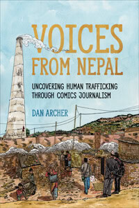
Meanwhile this week Alcatraz continues to rumble ahead, with the finish line now finally in sight; a new animation-based project involving Vietnam is in the works; I’m building another interactive piece, this time on the history of the International Criminal Court; pencilling some pages on a potential legal academic graphic novel; working on the follow-up to my crisis comix for Marketplace; AND laying the groundwork for my follow-up to last year’s Borderland, which will tell the story of trafficking in the US. Oh and the Stanford Graphic Novel Project! More about that on the soon to be re-launched”teaching” page – stay tuned for updates.
I can’t even remember the last time I posted so thank you my ever loyal web audience for hanging in there. I’ve just finished up teaching a 6-week comics course (2 classes a day, producing roughly 15 hand-drawn, inked and scanned 8-page minicomics every 10 days), the fruits of which (not to mention the labour) you can see below:


 Subject-wise, we had (deep breath): evil pillows; talking dogs; mice catching live cheese; toxic gloop; a shelter for made-up creatures called ‘hubs’; a talking cat bent on taking over the world; meteors; robot beauty pageants; musclemen (of course); talking pillows
(obviously a pillow trend going around 5-6th graders); time machines;
vampires; talking muffins; fratricidal ghosts; talking flying fish;
mysterious packages containing penguins; cute campers who have to
butcher a bear to survive out in the woods; twin weiner dogs; a halo
take-off; insurance clerks; talking toast; a water droplet and a
transvestite called Gerald. That’s all off the top of my head.
Whilst that’s been going on we’ve also -almost-managed to put to bed the Stanford Graphic Novel’s latest oeuvre. An amazing graphic novel set in one of the DR Congo’s National parks, it’s some 200 odd pages and is a testament to the drive, passion and commitment of everyone involved that it was first started back in January. Here’s a sneak preview of some of the revisions that are currently being frantically re-inked:
 Just when you thought I was going to take a break (or maybe that’s just my loving and tolerant wife), I’ve also turned my hand to animation, which is timely given the fact that as of tomorrow I’ll be teaching 3 weeks of Flash animation at San Jose’s tech museum. I’ll post my latest cartoon below, fingers crossed it works. Thanks to Queen for providing the soundtrack. I’ve also stuck some new watercolours up in the Gallery section for those of you interested in seeing my new colourful direction – quite how I can embrace that whilst not tripling how long it takes me to finish a page is, as yet, beyond me. Feel free to send in any suggestions.
Lastly, but by no means leastly, the hardhats piece continues to trundle along like the inky juggernaut it is – up to p.18 at the last count, though I’m reluctant to post any more pages up given the zany idea of actually making some money by having it published. News of that will be forthcoming, so stay tuned.
Here’s that cartoon I promised:
 I’m back in Cali after an xmas jaunt to the UK, hence the lack of recent updates, and it’s all kicking off. I’ve just finished next month’s Bash piece on Nigerian beggars, and am putting to bed the latest issue of Archcomix, which contains all of my recent non-fictional work. The Chile strip will be picking back up now, so be sure to stay tuned. I’m aiming to get it all done and dusted by Jan 28th. Fingers crossed.
I’ve joined the Stanford Graphic Novel Project as a TA of some description, where I’ll be contributing my artistic insights into what will be the follow-up to the highly successful Shake Girl graphic novel they made during last year’s class. Today’s assignement was a crit of Nick Abadzis’s Laika, which blew me away. Fantastic storytelling, great characters, excellent use of colour – well, why don’t you just read my 2 cents below:
For a story that is so tightly paced and heavily research-driven, there is a great looseness to the style of the book. Abadzis’s use of two techniques – drybrushing (using a paintbrush caked with dried ink to create a jagged, scratchy line) and drawing with a china marker (again, leaving a crayon-like mark) are both clearly visible on the cover and lend a real hand-crafted, impressionistic feel to the book. Both of these rely on being combined with colour to bring them to life, and the first sequence of Korolev’s escape from the Gulag shows just how crucial colorist Hilary Sycamore’s contribution to the book was. One subtle effect is the use of colour in the page background (in between panels) to reflect the change in temperature and mood – from the bleak black desperation of the first shot of Korolev, which gradually lightens with the presence of moon, until changing to normal white when he arrives at the inn. In a nice parallel, characters or backgrounds are reversed to their black and white negatives in moments of extreme emotion – such as p.14 when Korolev comes close to death, or p.143 when Yelena is told about Laika’s tragic fate.
 Abadzis seems well aware of his own weaknesses, hence the scarcity of large panel close-ups on chracters’ faces – one such jarring example being the old lady’s face on p26. However, when he gives up on accurate representation and instead aims to convey raw emotion, the faces get really interesting – see Mikhail’s anger on p37 or his demagogic Dad’s on p.31. When he does go in for a close-up, Abadzis ramps up his use of blacks and the grease pencil, like p.14, 119, 137, although I think he’d have been better off preserving the consistency of his ‘less is more’ style for the sake of heightening the drama.
Certainly, page layouts carefully consider their setting – p11’s vertical panels to emphasize the starry sky and the expanse between Korolev and the moon; p82 horizontal format and rhythmic ‘to and fro’ contrast of Kudryavka and the technicians testing for G-force, and of course the dream sequences. But one original addition that crops up a few times is Adbadzis’s use of overlapping panels, which work as a full-stop/periods, overriding the authority of the page breaks to jump space/time: p.20’s change of scene from Antonina and Mishin’s chat to Korolev’s meeting with Krushchev; the p.38 jump from Mikhail being outside to his decision later that night to drown poor old Laika; or to show the time lapse in p.147 when Laika’s being operated on. He quickly builds up a visual vocabulary so that we know immediately that a circular, non-bordered panel is a window into Laika’s dream-state (p. 88).
I felt the book started strong, but lost some of its power in the build-up to the launch as it sacrificed its characters to the needs of the plot. The wordless episodes early on where the emphasis was on Kudryavka’s character as she experiences the world around her – foraging for food after surviving being dumped in the river, or experiencing zero gravity for the first time (p.91) – really stood out as we watched the dog’s personality come to the fore against a really rich, vivid background.
Above Panel from Laika by Nick Abadzis, courtesy of First Second Books