To Top

Adding the spot tone using a Cintiq screen/tablet
Congratulations to the determined, dedicated, bleary-eyed, sleep-deprived, incredibly talented elite from the Stanford Graphic Novel Project 2010 who got our 192p graphic novel finally off to the printer yesterday. After a weekend full of post-production work on Illustrator and Photoshop, Monday night saw the handful of diehards switch seamlessly to Indesign to layout the final print-ready pdf, incorporating text tweak and colour edits along the way. This is only the third year of the Stanford GN project, but the progress the class has made is clearly visible from the jump in the production values, artwork and storytelling. Great job guys!
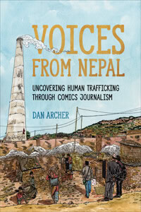
Now that Pika Don (“flash boom” in Japanese – the word used to described the atomic bomb blasts)’s finally finished, the next deadline is for the human trafficking comic I’m putting together with Fulbright Fellow, Olga Trusova. Olga’s been out in the Ukraine visiting NGOs and collecting victims’ testimonies for me to then turn into graphic narratives to give those that have been exploited a real voice. Too often even the most well-intentioned literature on human trafficking features the same visual motifs of girls in short skirts with pixelated faces walking down dimly-lit alleyways – despite the fact that sex trafficking is only one part of what is an enormous global industry. (Sweatshops, forced labour, piracy and fruit/vegetable picking are just some of the other categories). I’ll post some extracts on Friday to give you an idea.
Amidst the craziness of last week, I forgot to write up my part in an innovative new educational exercise created by social workers in Missouri. On Friday afternoon, Bay Area community leaders and organizers gathered at the Garden House Hotel in Palo Alto to be given an alias, as well as a background history. We were then ushered into one of the conference rooms to meet other members of our “family”: in my case, I was Pablo Perez, a 23-year old who had abruptly become head of the family when my divorced Dad was thrown in jail, leaving me to care for my two young teen sisters and their baby sister. The rules were as follows: we had to survive for 4 weeks (15mins of real-time each) below the poverty line, negotiating the kafka-esque labyrinth of social services, state benefits and pawn shops while ensuring that all household members were fed and the utilites weren’t shut off. The perimeter of the conference room was arranged with tables representing the different organizations we needed to visit: employment agency, bank, pawnshop, supermarket, utility company, daycare, police station – and to add an extra headache-inducing element, we could only move from table to table by surrendering a ‘transport pass’, which we had to buy when we ran out. This was to reflect the proportion of benefits that end up wasted on expensive local transport when people try to make their way out homeless shelters for real.
Here’s a video of the same poverty simulation being run in Pittsburgh to give you more of a sense of what it felt like to participate:
Needless to say, what started out as an interesting interactive exercise turned into a stressful, exhausting nightmare as we were deliberately kept waiting, hamstrung by misfiled paperwork and long queues everywhere we went. Some particular highlights included being robbed of a transport pass by none other than local council member Greg Scharff, or of $20 by a homeless outreach specialist. I might add that both were in character at the time, but the irony wasn’t lost on me. Here’s a full write-up of the afternoon by the local Palo Alto Daily, including a description of the above incidents:
Dan Archer, a social issues cartoonist from Mountain View, stood befuddled in the middle of the room after his character was robbed of his cash on the way to the grocery. It was the same money he had spent so long obtaining in the previous week that he was late picking up his child at day care.
All in all, it was an excellent way to raise awareness of a vital issue that applies to communities nationwide, far more powerful and resonating than a lecture or article, and further proof that interactivity is a key trigger for engaging with an audience on what some might deem “dry” topics. For more information, visit visit Step Up Silicon Valley’s website at www.catholiccharitiesscc.org/stepupsv/ or the Downtown Streets Team’s website at www.streetsteam.com.
Last but not least, here’s the full video of comics journalist Joe Sacco‘s acceptance speech of his highly deserved Ridenhour Prize for Investigative Journalism. Interesting to see the stigma against the term “graphic novel” in his closing comments, as opposed to “comic book”, which he prefers. Surely it’s a formal question of length (comic books being serialised 28pp saddle stiched), while a graphic novels are self-contained, 80pp+ works? As ever, your comments are welcome below.
Friday, May 8th 1970 marked the 40th anniversary of the Hardhat Riots, the subject of my upcoming graphic novel. Read all about it on the Hardhats page, together with some new photo evidence from the day that recently surfaced. Also, I’ve created an official press release for the Honduran Coup comic on the Honduras page – the link is so please RT it and share it around!
Here’s my page from the Stanford Graphic Novel Project’s latest book, based on the amazing true story of Tsutomu Yamaguchi, one of the few survivors of both of the atomic bombs that were dropped on Japan in the final days of WW2. Yamaguchi was actually at ground zero (within 3km of the blast’s epicentre) for both the Hiroshima and Nagasaki detonations, and his testimony as to the after-effects and devasatation wrought by the blasts is truly unique. The above page is thanks to Topher, one of head thumbnailers and project managers, who gave me the Chris Ware-esque thumbnailed blueprint. Although I baulked at first, it was actually a lot of fun to pencil and I think the multiple actions contrasted with the near-silence of the page works especially well. More on the class’s amazing journey from conceiving of the graphic novel to getting it off to the printers (fingers crossed) within 6 months to follow next week. Once it’s done, that is. Here’s my original post about the project.
 The first time I opened The Lindbergh Child, it was hard not to be impressed by the artwork. The meticulous hatching, the double bordered panel outlines, the perfectly laid out text always running parallel to the panel borders – there’s a lot to admire. But unlike Laika, once I got a few pages in, I found the art to actually be a barrier to my immersion in the narrative. Each page seemed so crafted, so planned out (no mean feat next to Abadzis’s 8 drafts of every page) that it stifled the flow, and reminded me at several different points that I was reading a very well-researched graphic documentary of an event, as opposed to reliving it in the way I did Laika.
Going back to the artwork briefly, the key to leading a reader’s eye across a page of comics lies in “spotting” the blacks – that is, positioning large masses of black around the page to highlight specific parts. For example, the back of Violet Sharpe’s head on the second page of Part Four (ah the joys of no page numbers). Geary’s decision to reflect the character of the time – a society that stressed formality and rigidity to certain norms – in his heavy black panel borders undoubtedly lends an extra dimension to our understanding of the time the novel was set in. However, it does this at the expense of our ability to read each page easily – very quickly I found that against such a heavy black background, the detail of the panels with all their hatching soon greyed out and flattened the images within them. Take the first page of Part Seven, when we see Hauptmann behind bars – compare the top half of the page with the bottom and see how his lower body blends against the unnecessary detail behind him in the cell.
The next most significant factor in jarring me out of the narrative was the running commentary given to us in the form of captions, which at times lapsed into plain and simple illustration of what was drawn in the panel below. Condon’s rendez-vous in the St. Raymond’s cemetery breaks one of the cardinal rules in comics of ‘show, don’t tell’ – we see Condon in the middle of the panel, a car behind him and the gate of the cemetery to his right. The caption reads: “They stop at the Cemetery’s entrance, Condon gets out, leaving Lindbergh in the car. But he hesitates to enter the dark and threatening interior”.
The opportunity to highlight his internal monologue and introduce a more subjective POV is refuted by the dry, objective third person narrator. A sign for the cemetery and a close up on Condon’s hesitant, apprehensive face with Lindbergh telling him he’s wait in the car would have conveyed the same information with a much better sense of mood and atmosphere.
It’s not all bad, though! The sheer amount of detail and information Geary fits in clearly meant he had to choose between characterization or documentation and he chose the latter, leaving it to read like more of a court document than a dramatization. But in certain instances when the evidence comes to the fore, this approach works perfectly: the two pages describing poor Arthur Koehler’s journey around the country on the trail of wood with the same seam is a testament to both his and Geary’s borderline obsession with uncovering every last shred of evidence in the case.
I certainly learned a lot from this book about the case, but it definitely didn’t have anywhere near the same emotional punch as Laika did. In fact, I was more exasperated by the futility of the ending than I was actually sympathetic. But as an artist who sometimes falls into the same trap of using characters purely as vehicles to advance the plot of a comic, I identified with many of Geary’s decisions and will take away several lessons in how to improve my own work.