To Top
My latest comics journalism piece on the International Criminal Court will be published online at Cartoon Movement on Wednesday. It uses a new framework for scrolling through a historical timeline that I’ve built, and I’d love to hear feedback, so be sure to stop by, check it out and leave a comment.
Oh and in case you missed it (what? you don’t already follow me on Twitter? All is forgiven, just click here) please vote for the two ONA (online news association) panels – Comics Journalism (natch) and Financing Meaningful Journalism. You’ll need a reddit account. Yes, it’s simple to set up and can be your good deed for the day.
More news on my intermittent musings and other upcoming/recently finished projects below the fold. Just scroll on down.
My latest interactive comic is now live at Poynter.org – click here to read it in all of its interactive glory.
The eagle-eyed amongst you will also notice that my latest comic on the Hard Hat Riots of 1970 is now available for pre-order via the widget on the right-hand sidebar.
First, a test video for your viewing delectation and feedback: is the speed too fast? Is the text legible enough? Talk about your low-fi setups…
Below is a transcript of a recent email conversation I had with a fellow multimedia storyteller, Bo Soremsky, who put together this awesome interactive piece about a trial in his native Germany. Bo’s Qs are in bold.
People often ask me why i’m drawing pictures instead of taking photos. I’m sure you are familiar with that question. What’s your take on this?
People often forget that photos can be editorialized just as much as drawn images. Personally, I think a drawing is all the more sincere in explicitly revealing that the object depicted has been run through a subjective filter. All too often do readers forget that even a photographer has to crop in/out the elements they don’t want in a frame, and that’s before the editor has their say. Not to mention the possibility of it being tampered with in photoshop. To me, drawn images are the most accurate way of translating what’s in our heads onto paper – crystallizing our subjective experience. Provided a journalist is up front about that, I don’t see what the problem is, beyond the traditional aversion to what’s innovative versus something that’s been traditionally accepted. [Perfect example: Newsweek’s cropping of a Dick Cheney photo in 2009, prompting the longest comment thread ever on the NYTimes Lens blog – http://lens.blogs.nytimes.com/2009/09/17/essay-9/]
Without doubt drawings provide a very subjective view of the subject. So, how do you create authenticity? One answer to that question can be found in your hypercomic: By clicking on a panel the reader gets access to supporting documents. Thats a great way to prove your assertions. But are there other possibilities to convince the reader that you are telling the truth?
Sources are always going to be the key to authenticity, and linking is certainly one of the best ways around that. Incorporating more multimedia, housing multiple, corroborative views together could be another. I don’t think one single “truth” exists – even if you and I experienced the same event next to each other, we’d record and report it differently.
What do you think are the advantages of a digital reportage over a printed one? Does interactivity really help to tell good and authentic stories? Couldn’t it be to complicated and confusing?
I think interactivity is one of the few ways of demanding a reader’s engagement and involvement – readers/viewers get let off too easily these days in the era of clicking off youtube videos or channel surfing. Only by forcing the reader to drive the story can we be sure they are fully committed to the narrative – much like the way agency works in between comics panels to make sequential images seem like they’re part of the same story. It could well be complicated – the key is marrying a compelling story with an intuitive interface – no mean feat! (Not to mention being paid well enough to make it in the first place).
As promised, see below for a brief sampler of the anthology produced by students in my recent graphic novel course at EPGY. This preview features work from Beiatrix Pedrasa and Heywood Ye – all the more impressive considering they only had 12 days to put their stories together. More previews will be posted shortly, so support this new generation of visual storytellers and come back/share the link/tweet/shout it from the rooftops etc.
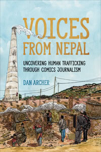
As I’m currently working on my Knight project these days, I thought I’d point you towards some of my earlier work you may not have seen – a piece that ran in Bash Magazine a few years back. Go here to read the whole comic, hidden as it is under the US Politics tab at the top of the page. Remember to RT/share it around it if you liked it, or -even better!- head to the Archcomix store to order your hard copy. ($5 plus shipping/P&P).