In the wake of SXSW interactive earlier this week, the web has lit up with talk of new technologies for revolutionizing news content and consumption. Speaking of which, here are the winners of the festival’s web award winners, sneaking you a glimpse of the future apparently. Though that was on Monday, so it just about balances out as the present. One of the buzz words in the ‘future of journalism’ panel was the idea of context, and essentially how the outpouring (and overflowing) of real-time news via all the now widely-accepted feeds are actually numbing the public’s interest in important topics as opposed to stimulating it. The answer? Many suggested harking back to narrative approaches, with the most-often quoted perfect example of detailed, informative and, most importantly, engaging reporting coming courtesy of This American Life and their Giant Pool of Money episode. For those of you hearing about it for the first time, TAL is one of the best podcasts out there, is streamed for free every Monday, and is available for subscription through itunes. Go. Now. Subscribed? Ok. You should also try Radiolab too, which is of the same ilk. Please – if you can recommend any more, leave a comment or email me – I’m in the process of creating a links page where I’ll house this aural treasure trove.
The reason why these two podcasts are so phenomenally successful and effective? Because of the way narratives are interwoven with the raw data of a topic. We meet the characters, we hear them explaining their actions from their point of view, and we get a sense for why they acted the way they did – whether they’re mortgage brokers or first-time buyers taking out loans they can’t afford to pay back. Obviously, TAL’s medium is different from mine, so my focus is visual, but it got me thinking – what are other ways to incorporate narrative in news reporting?
Photojournalist Ed Kashi has embraced a multimedia approach by creating a fast-streaming slideshow of his photos around Iraqi Kurdistan – somehow bypassing the intrusive glare of a videocamera to present a far better portrait of the subjects in his shots than I’ve seen in any live feed. I especially like that Ed’s shots include sequences that wouldn’t necessarily be chosen using the standard means of narrowing down a selection for an editorial piece. One much-trumpeted yet arguably not so effective use of multimedia is the launch of VIVmag, one of the first digital-only magazines focusing its production around the soon-to-be available technologies of the ipad. For all its whistles and bells however, I can’t help but think that the information being presented in this sample article below is still appearing in standard blocks of text. Granted, the transition from block to block is cinematic, but that strikes me as more of a fancy page turn than a fully interactive approach using narrative innovation. One example of this is at 0:34 secs in, with the ‘You Might Get Aids’ header. Your comments welcome.
Now let’s move the spotlight to a couple of different online apps, the Survivors Connect Map and this incredible one of Haiti, courtesy of Ushahidi. Both are open to (better yet – dependent on) the public for submissions, displaying all data that is submitted in an unfolding narrative of the situation on the ground. This isn’t just news, it’s a tool for NGOs to more effectively channel their resources where they’re needed. Suddenly Haiti isn’t just another global disaster a million miles away – it’s heartfelt messages coming from specific addresses that make it feel like it’s happening next door. (Where did all those Haiti donations go, by the way?). A similar technology is available domestically through twitter, allowing you to search for specific terms used near a location, although presumably you have to go through following whoever you find before you can contact them directly. Of course, one thing missing from the real-time turnaround (as mention above) is someone to lead you through that data. But who?
Look no further than Edward Tufte, the ‘Da Vinci of data’, who has recently been appointed by the Obama administration to a committee tasked with presenting a coherent, intelligible layman’s guide to the Federal Stimulus package. And, more importantly, where all the several hundred billions of dollars of it went. Of Tufte’s many innovations are what are called ‘sparklines‘ – succint snippets of information, standing in defiant opposition to the cluttered complexity of a standard graph. One example of how fascinated we are by infographics, one of Mr Tufte’s specialities, is this one which was recently one of Digg’s top picks, despite lacking links or any substantiating evidence whatsoever.
What better way to kickstart this week than with a caricature of Jean Baudrillard spliced onto Tinkerbell’s body from a recent commission?  Click here to view Jean in all his transvestite glory. Here’s a snippet from his Simulacra and Simulation (come on people, even The Matrix directors co-opted it) to explain Jean’s link to Disneyland:
The objective profile of the United States, then, may be traced throughout Disneyland, even down to the morphology of individuals and the crowd. All its values are exalted here, in miniature and comic-strip form. Embalmed and pacified. Whence the possibility of an ideological analysis of Disneyland: digest of the American way of life, panegyric to American values, idealized transposition of a contradictory reality. To be sure. But this conceals something else, and that “ideological” blanket exactly serves to cover over a third-order simulation: Disneyland is there to conceal the fact that it is the “real” country, all of “real” America, which is Disneyland (just as prisons are there to conceal the fact that it is the social in its entirety, in its banal omnipresence, which is carceral). Disneyland is presented as imaginary in order to make us believe that the rest is real, when in fact all of Los Angeles and the America surrounding it are no longer real, but of the order of the hyperreal and of simulation. It is no longer a question of a false representation of reality (ideology), but of concealing the fact that the real is no longer real, and thus of saving the reality principle.
Turns out Mickey’s a demagogue. For an arguably harsher treatment of Walt’s shrangi-la, checkout Luis Marin’s “Utopic Degeneration: Disneyland”. One of the many interesting points Baudrillard covers (hold tight for a seamless link) is the different phases of the image: 1 It is the reflection of a basic reality; 2 It masks and perverts a basic reality; 3 It masks the absence of a basic reality; 4 It bears no relation to any reality whatever: it is its own pure simulacrum.
Recently I’ve been looking into the power of the photo as a conduit to “the truth” after being recommended Errol Morris’ blog at the New York Times (from where the series of below images is taken: Graphic by Dan Mooney for Errol Morris/ Photographs by Ben Curtis/ Associated Press). One question that always comes up in comics journalism is “aren’t you recreating what you imagine a particular scene to be?”, as opposed to photojournalists, who are presumably documenting what’s in front of their lens. Short answer? No. As the below images attest (aside from today’s sporadic fascination with all things Disney), the significance and ‘truth’ of an image is dependent on it context. Just like panels in a longer sequential narrative, the visual data in a photo can easily be subjected to myriad interpretations, depending on the information that it’s couched in. As Ben Curtis, the photographer from below, says: The caption is the thing that provides accurate context. And without an accurate context or with a misleading context, you can completely distort the meaning of an image.
 Another interesting point Morris makes in a different post, “photography as a weapon“, when a neuroscientist reveals that approximately 30 to 50% of our brain is dedicated to visual processing. When text accompanies an image, however, the linguistic interpretation occurs in a different part of our brains, prompting a cognitive emphasis on the image over the text, even if the text is clearly telling us not to trust the image.
In the words of Dr Hany Farid from Dartmouth: “It raises a whole other level of information warfare…You intentionally put things out there just to know that the controversy in and off itself will help you make your point.”
 It’s been a busy week since the cover went up on Monday – plans are afoot to secure distribution of the comic in Honduras, but more on that once it -finally- goes to print. After the success of the interactive cover vote last week, I’m launching more ways to get you, dear readers, to voice you own vitriol down the archcomix megaphone. The main way for now is through the forum I’ve set up on the Archcomix fan page here – go and post comments or share links/info that you want to see included in an upcoming piece that I’m working on about the Jewish lobby in the US. Any suggestions for a wordpress-friendly forum widget would also be good.
The hard copy of the Independent World Report also arrived this week, featuring my Chagos comic, as well as a moving photo journalism piece on African immigrants who are permanently stranded in Malta after abortive efforts to get to europe and have adopted a WW2 hangar as their home. Speaking of Chagos, for those of you from glorious Britannia who contacted your MPs about the Early Day Motion I mentioned last week, here’s to hoping the response you got was more successful (not to mention vague) than mine: “whilst I cannot commit to signing EDM 960 at this point in time, I will certainly give the issue my consideration”. Any chance the said point in time is after the elections have been and gone? The Chagossians’ plight has recently been added to with the introduction of a plan to turn the surrounding nature area around the base on Diego Garcia into Britain’s ‘Great Barrier Reef’. A big coup for conservation, but unfortunately Foreign Secretary David Miliband’s conservation focus lies on flora and fauna, and not the thousand or so remaining displaced inhabitants who were evicted or born in exile since the 1960s. Worse still is the fact that many people were duped into signing a petition for the creation of the said area, with no idea that the organizers had been forced into denying the Chagossians’ their rights in its establishment. More on this from the Guardian UK here. Speaking of marine conservation, here’s a great example of animation being used for edutainment – though is it informative enough to inspire/engage with someone with no background knowledge of the issue? Leave a comment and let me know.
As you’ll have seen above, the cover to the Honduran Coup: A Graphic History is now finished, and patiently awaiting a journey to the printers. There’s nothing quite like drawing a crowd of riot police to get you thinking about civil disobedience and the concomitant governmental responses, especially in conjunction with an unnerving yet fantastic piece in the March issue of Harper’s Magazine that I came across recently. The article’s about the development and proliferation of non-lethal weapons for crowd control and ‘peaceful engagement’ of civilian protests, and cites numerous examples of these cuddly alternatives such as the LRAD (Long Range Acoustic Device) and the neuro-chemical agent that reportedly played a pivotal role in ending the Chechen Hostage Crisis. Killing most, if not all, of the hostages in the process. Readers of this blog will also remember the LRAD’s role in the Honduran coup crisis, one which was actively denied by the de facto regime despite televised images such as this one (see left) being broadcast by Telesur. Its ear-shattering debut on US soil was at the Pittsburgh G20 protests, which you can witness below for yourself.
For the long wishlist of other techno-gadgets that every repressive government shouldn’t be without, click here. Granted, it’s from 2003 – from “Nonlethal Weapons: Terms and References,” a report published by the United States Air Force Institute for National Security Studies – and many on the list are still at the ‘proposal’ stage, but it’s good to see security officials really getting creative with their futuristic weaponised fantasies.
My personal favourite is under the ‘Holograms’ section entitled, Prophet: The projection of the image of an ancient god over an enemy capital whose public communications have been seized and used against it in a massive psychological operation. Doctor Manhattan eat your heart out.
Speaking of imaginative flights of fancy when it comes to security, Secretary of State Clinton is currently on a tour of central america and stopped off in Guatemala where she wished Honduran ‘President’ Pepe Lobo well and urged the rest of Latin America to take his government seriously. Or recognize them, for a start. She told those assembled (including Lobo himself) “We support the work that President Lobo is doing to promote national unity and strengthen democracy,” and went on to say that the US is restoring all aid to the country. No matter that the human rights situation in the country continues to worsen by the day, prompting first the Director of Human Rights Watch to write to the Honduran Attorney General and now nine members of congress to write directly to Clinton to investigate the abuses. Here’s their letter.
Voila, the cover to the Honduran Coup comic, destined for the printers later this month. News, non-lethal weapons and Hillary Clinton in Honduras below.
See below for the full story about the Chagos islands and the installation of a massive US/UK military base, the creation of which required the illegal, forced eviction of the native islanders in the 1960s.
A recent communique from the UK Chagos Support Associations reveals that next week an Early Day Motion (EDM) is being proposed in Parliament to discuss the possibility of a final settlement for the displaced Chagossians whose stories I tell in my 4-page comic, ‘The Right to Return’. You can see a sample page above, and the whole comic is at the bottom of this post.
For even more background info, read my original post on the comic here or visit the UK Chagos Support Association’s website. If that’s still not enough, I highly recommend David Vine’s ‘Island of Shame’ or John Pilger’s film, ‘Stealing a Nation’, below:
So here’s where you Britishers come in: you need to contact your MP and ask them to sign EDM number 960 Chagos Islands as soon as possible. Here’s the link. Don’t know who your MP is or how to contact them? Then turn to the ever-excellent They Work for You site, type in your postcode and hey presto – instant constituent power is yours.
The gist of the EDM proposes:
That this House believes that the interests of the Chagossian people and of Mauritius must be fully protected in the proposed Marine Protected Area; urges the Government to withdraw its case from the European Court of Human Rights and to settle out of court, as already suggested by the Court; and requests the Prime Minister to engage with Mauritius and the Chagossians, before the general election, in order to initiate discussion on an overall settlement of the issues, including timetable for eventual transfer of sovereignty of the Outer Islands to Mauritius and provision for a limited settlement on the Outer Islands.
As ever, please forward, RT and share the links in this post around – this is the last hope of the displaced Chagossians after a protracted legal struggle that has lasted decades.
[GALLERY=14]
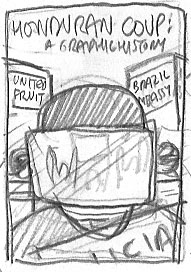 Thank you to those of you who voted for the cover design this week. After tallying up the combined interactive might of facebook comments, comments on my website (always looking for more, polls aside) and the poll I posted a link to, we have a clear winner. Number 3!
Justifying reasons included: it jumps out at you; it’s got more visual impact; it puts you directly in the scene; it’s more dynamic than the other designs. I have to confess, I was all for the first design (sort of a cast of characters lined up), until the votes made me reconsider just how effective (as opposed to informative) it was. So I’m proud to announce that no.3 has already been on my drawing board and is primed for the scanner – the full colour version should be up on Friday, so be sure to check back in and leave your comments then.
Speaking of impacting visuals, I recently came across the amazing talents of Kseniya Simonova, the winner of (dare I say it) Ukraine’s got talent. Her talent? Creating a live animation (that’s in 8 minutes of real-time) about the devastation wrought in the Ukraine during World War 2. Not the first time that the ‘…’s got talent’ franchise has brought millions to tears, but thankfully the first when they’ve actually been genuinely moved and -dare I say it – been intellectually engaged at the same time. But don’t take my word for it – here’s her in action in the final.
It’s an interesting trend that seems to have also caught on over at the Guardian UK, where Patrick Blower has created a niche column called ‘Live Draw’ that uses time-lapse photography coupled with screen capture to show readers how his editorial cartoons are created, line by line. Checkout his recent ‘Alice in Blunderland’ cartoon or the archive. Interesting how he’s referred to as a ‘cartoonist’ and a ‘multimedia artist’ – presumably ‘multimedia cartoonist’ is too much of a mouthful. Comparing the two, I think the real seductive power lies in the sequential narrative that’s being created – Blower includes single panel gags that he builds up over the course of a minute, but these aren’t anything as powerful or entertaining as his tableaux that incorporate different scenes and viewpoints, like this introductory animation on his website’s homepage. The challenge now is to incorporate more of a didactic element into these multimedia creations – to give new readers/members of the audience an introduction to the content or themes that appear in the work, or at least a way of following up if their interested is piqued.You’ll notice that only a handful of the comments in Blower’s Alice animation even acknowledge the piece’s status as a cartoon – it’s more soapboxing back and forth than anything, so obviously it’s appealing to an audience already familiar with the issue. I wonder how the approach could be altered to bring politics to life for someone whose not politically engaged. Suggestions? Stay tuned for my tentative experiments with a similar process in the future.
In case you missed it, voting is still open for your favourite cover design of the four that I posted on Friday – scroll down to view them, then leave a comment or vote using this here link.
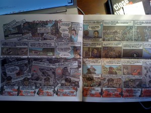
The School of the Americas comic is now in print as the full-colour centrefold (now then) of the latest issue of Presente!, the School of the Americas Watch newsletter. Here it is in all its tactile glory on my desk. Order your free copy and find out more about the SOAW here.
And in case you’ve had your head in the sand the last few days, or are an ardent global warming naysayer (not that there’s much of a difference, admittedly), spare a thought for the poor souls in Chile, who are reeling from one of the strongest earthquakes in recorded history that has destroyed 1.5 million homes and left 700 dead, with the toll expected to rise. It turns out that the strongest ever earthquake (a massive 9.5 on the Richter scale) also hit Chile, some 50 years ago, making it the go-to place for seismologists to conduct research. So thankfully, emergency procedures and containment plans for recovering from such a disaster were already in place and no doubt saved a large number of lives. More on this from the BBC here.
Naturally, comparisons have immediately been drawn between the devastation in Haiti and Chile. Despite Chile’s quake being 5 times stronger, the damage is considerably less than January’s quake, largely due not only to the fact that the epicentre of the Haitian quake was much closer to the surface, but also to the far more advanced construction of Chilean buildings (for reasons outlined above). Another point also worth bearing in mind is the rapid, efficient response of Chilean President Michele Bachelet to the disaster: she held off immediate foreign aid for fear of complications; ordered police to allow victims free access to essential supplies from supermarkets; and was soon offering minute-by-minute updates on the recovery efforts. A far cry from the debacle in Haiti, where international efforts were complicated by the US unilateral takeover of the main airport and subsequent diversion of non-US approved flights, plus the worrying number of US troops (reportedly around 10,000) who were deployed ‘for security purposes’. Surely emergency disaster relief is the UN’s chief role? So it would seem on their website.
Saddest of all is the ‘satire’ of Pat Robertson’s now legendary diatribe against Haiti, which some eager blogger cut and pasted to fit the latest Chilean disaster. Sadder still is that so many in the blogosphere fell for it (here’s the full summary), taking it as a real report. Staying with Chile, below is a comic from the archive that I put together about the US involvement in the 1973 Chilean coup that ousted Salvador Allende. My thoughts, condolences and best wishes go out to those affected in Chile.
[GALLERY=2]
 Yesterday I was lucky enough to spend the day with visiting graphic novelist Nick Abadzis, creator of the Eisner award-winning Laika. He visited the Stanford Graphic Novel class on Weds, offering some great advice on our atomic bomb story and how to get your work seen by publishers. Later that night he then gave a fascinating talk on his research process and the steps he took from the original idea behind Laika all the way through to finished artwork – including a visit to Moscow to get a feel for his backdrop. Yesterday he, Adam Johnson and I went down to Cal Poly in San Luis Obispo, where Nick offered similar wisdom to the students there, as well as signing the odd dozen copies, each with a meticulously crafted (not to mention lightning fast) dedicated illustration. Here’s the man at work – note the blurred brushpen. A true cartooning gent and top dog (groan). Thanks Nick!
And now, the chance for you to get involved in the creative process of Honduran Coup comic. Below are 4 potential designs for the cover. Have a look at the four different options below and then register your vote for the favourite one using the poll I’ve created here. I’ll announce the results next week. This is a first-time experiment for me, so depending on how many votes come in I’ll expand more interactivity into this site in the coming months. Anyway, back to the voting options:
Number 1 Number 2
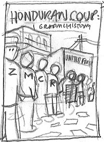
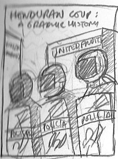
Number 3 Number 4


I’m leaning towards number 1 at the moment, which features Zelaya (Z), Micheletti (M), Clinton (C), Romero (R), riot police and Zelaya supporters in a line, outside the Brazilian Embassy and United Fruit factory (for its historical connection to US interests in Central America). Cover 2 features a line of said riot police, no.3 focuses on the reflection of supporters in the protective visor of a riot police officer (my second choice) and no.4 is more of a boxing showdown-style setup with Zelaya facing off with Micheletti, leaving the rest of the ensemble cast in the background.